How to Create a Successful Exit Intent Popup?
Top marketers understand how to design elegant, precise, and genuinely helpful exit intent popups that pique a user's curiosity as they prepare to leave a website. Having said that, effective exit intent popups have consistently been demonstrated to significantly enhance conversion rates for companies of all sizes.
But how do you go about making an exit intent popup that converts well? To learn everything you need to know about creating one on your own, continue reading.
What is an exit popup?
An exit popup is displayed to a website visitor who is prepared to leave with a marketing message. Marketers employ exit popups for a number of reasons, including adding a visitor to their email list, convincing them to complete their purchase, stopping them from leaving, and more. In the past, exit popups were plain overlays that appeared in the center of the browser window. However, the method did develop over time to include different screen placements, popup designs, and message types that aid in increasing visitor engagement.
How to create a great exit popup
Focus on the CTA
If the user doesn't take action, the exit intent popup with all its lights and whistles is meaningless. Your CTA needs to be engaging and unambiguous. Typically, this is providing a no-cost service, a discount, a no-cost download, or access to an exclusive upgrade.
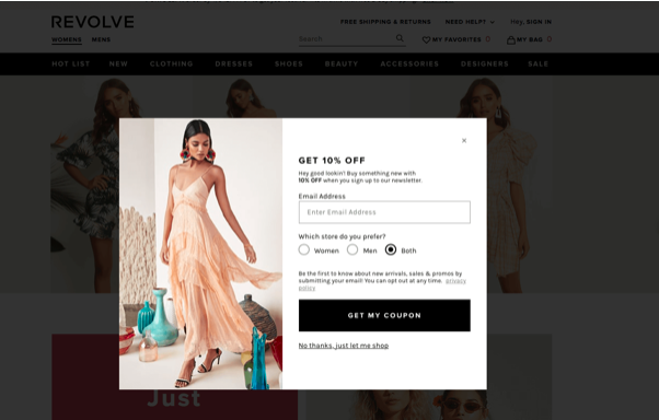
Focus on that offering if you know you convert better when you offer coupons. Sometimes it's best to keep things straightforward, as seen in the way the e-commerce site Revolve makes it apparent that when you click the button, you'll instantly have the option to save money.
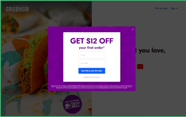
Making the CTA relevant to the user intent by personalizing the offer to the page is even better. For instance, Grubhub excels at being direct and audacious. They add a lovely touch by offering a discount of $12 off, a less-frequently used amount. This draws attention since it is unique. Our minds don't expect such an odd number. Additionally, they keep us on our toes and grab our attention by subtly changing the messaging.
Write a great headline
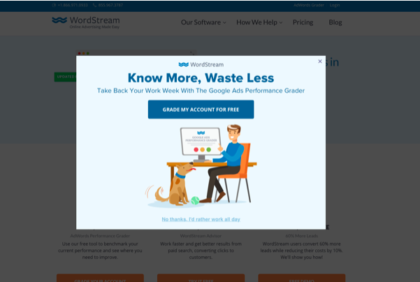
People are naturally going to read the headline first, therefore a smart exit intent popup will immediately grab our attention with a catchy header. We're just wired that way. WordStream gives a good illustration. Simple, direct, and to the point, "Know more, waste less" is a catchphrase. The whole attention of readers should be paid to anything that promises to further knowledge while alleviating problems.
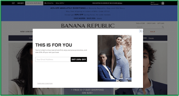
Similar to how Banana Republic's headline, which was clear and provocative, immediately drew our attention. It appeals to human psychology and causes readers to pause and consider, "For me? Cool! The goal of this popup, despite its lack of personalization and general nature, is to draw readers.
Write standout copy
If someone takes the time to read the popup's copy, it's likely because the headline caught their attention and piqued their interest in making a purchase. Be as thorough as you can be without sacrificing conciseness. You only have a limited amount of space in exit intent popups, so be concise.
Sujan Patel completes his exit intent popup by supplying evidence that he merits consideration as a thinking leader.
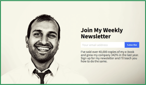
When creating an effective popup, clarity is key. Getting to the point fast can be a fantastic strategy to increase conversions because you frequently only have a few seconds to persuade someone that the offer is significant before they click away and continue reading the content.
Be aesthetically interesting
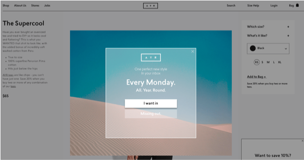
The exit intent popup that the women's fashion brand AYR created is obviously the product of some designer flair. You can't help but savor the picture because of the frame, the beautiful sky, and the lovely sand dunes. More thoughtful popups that calm us rather than try to sell us anything would be beneficial for all of us.
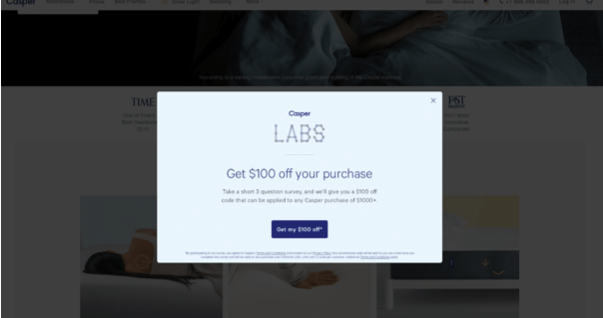
In their popup, Casper Labs uses a quirky and vibrant font. The distinctive and captivating look grabs your attention even if you have no idea what Casper Labs is.
Highlight your credentials.
Even though you might be a well-known tech investor or a talented writer, a blog reader might not be aware of it. Because of this, it's crucial to create credibility by mentioning some of the top newspapers and companies you've collaborated with.
People are far more inclined to subscribe to a newsletter from someone who has been featured in the New York Times and the Wall Street Journal.
Akin to how SaaS companies frequently leverage prime homepage real estate to prominently show social proof in the form of the logos of their best customers, name-dropping in an exit intent popup is similar to that practice.
Make it personal
Thrillist users frequently search for exciting activities in their local areas. It is wise that they attempt to focus on the precise location of visitors in their exit intent popup so they can provide the greatest advice. A high-value user could also be somebody who takes the effort to manually enter a code.
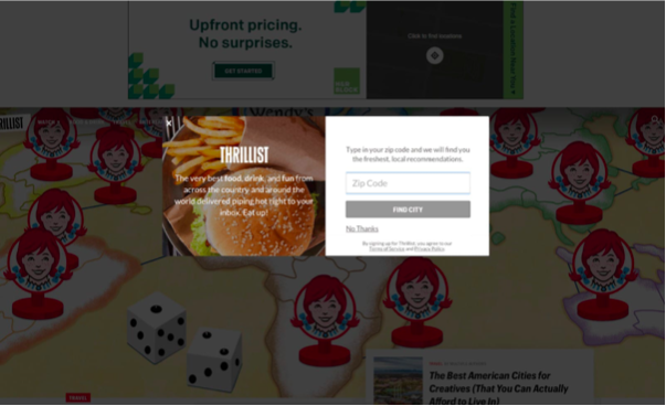
Make an effort to appear as human and non-automated as you can in your popup.
Conclusion
Even though there are infinite possible designs for exit intent popups, one thing becomes abundantly evident when you look at the best ones: they are timeless. Through targeting, a catchy title, or a gorgeous image, they grab your attention and keep it.
